Design

ISLE OF MINE REVERIE LAUNCH

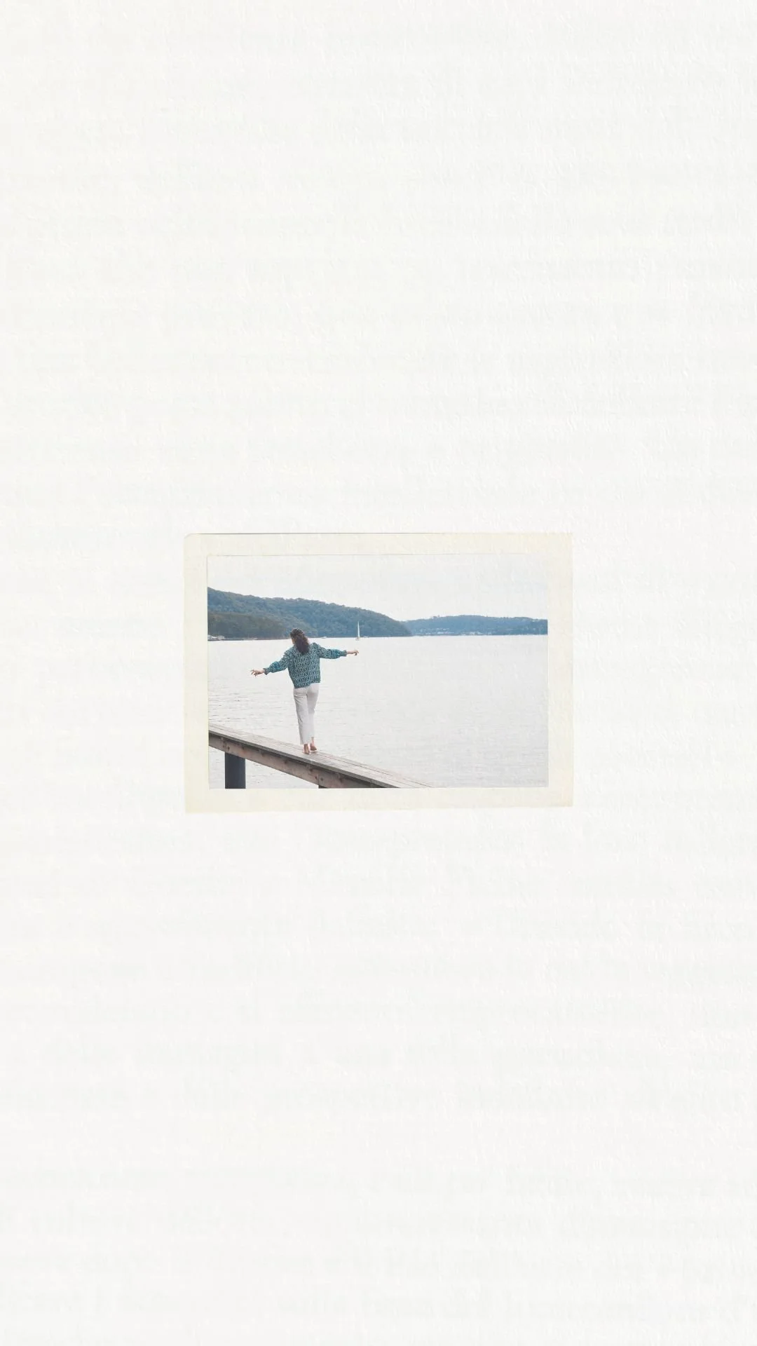
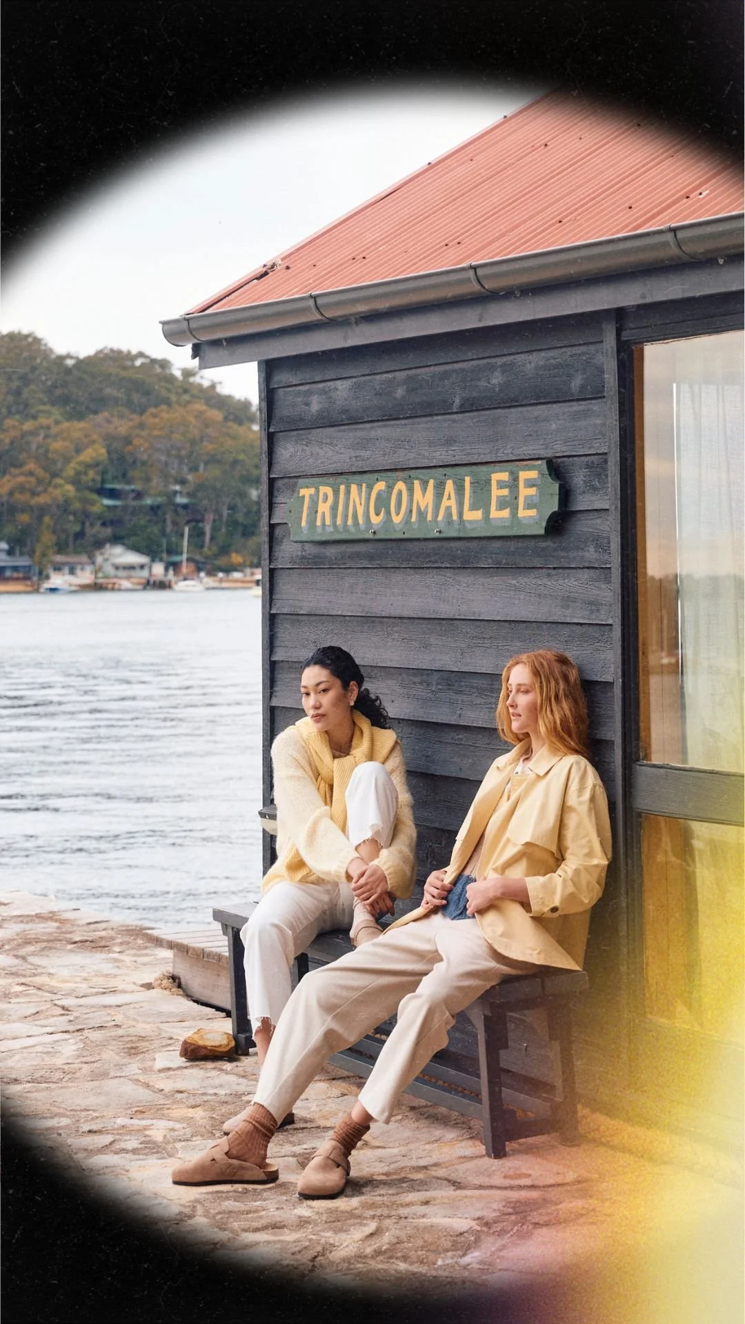
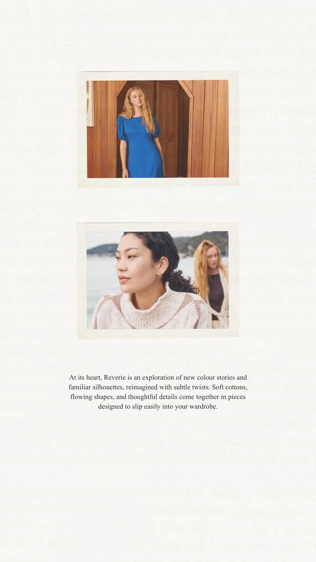
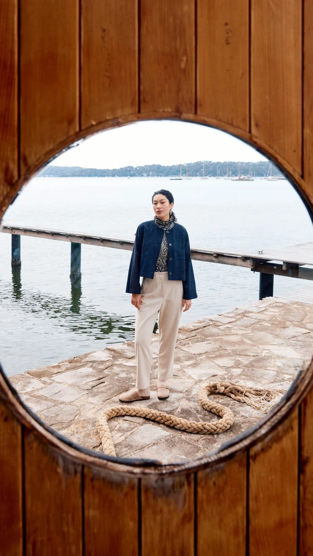
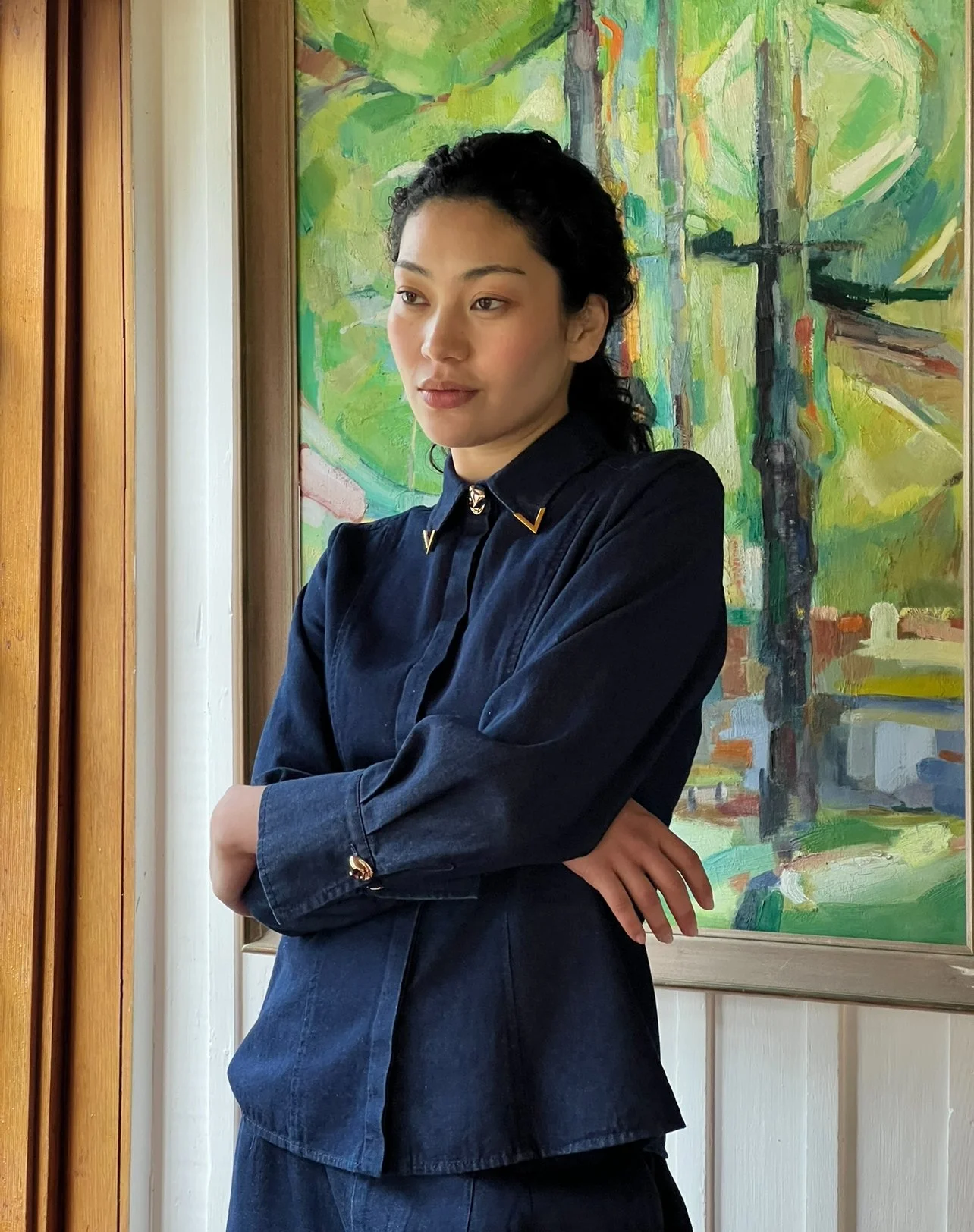
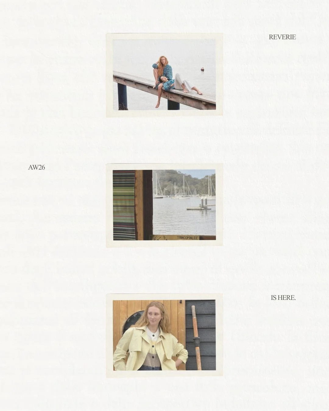
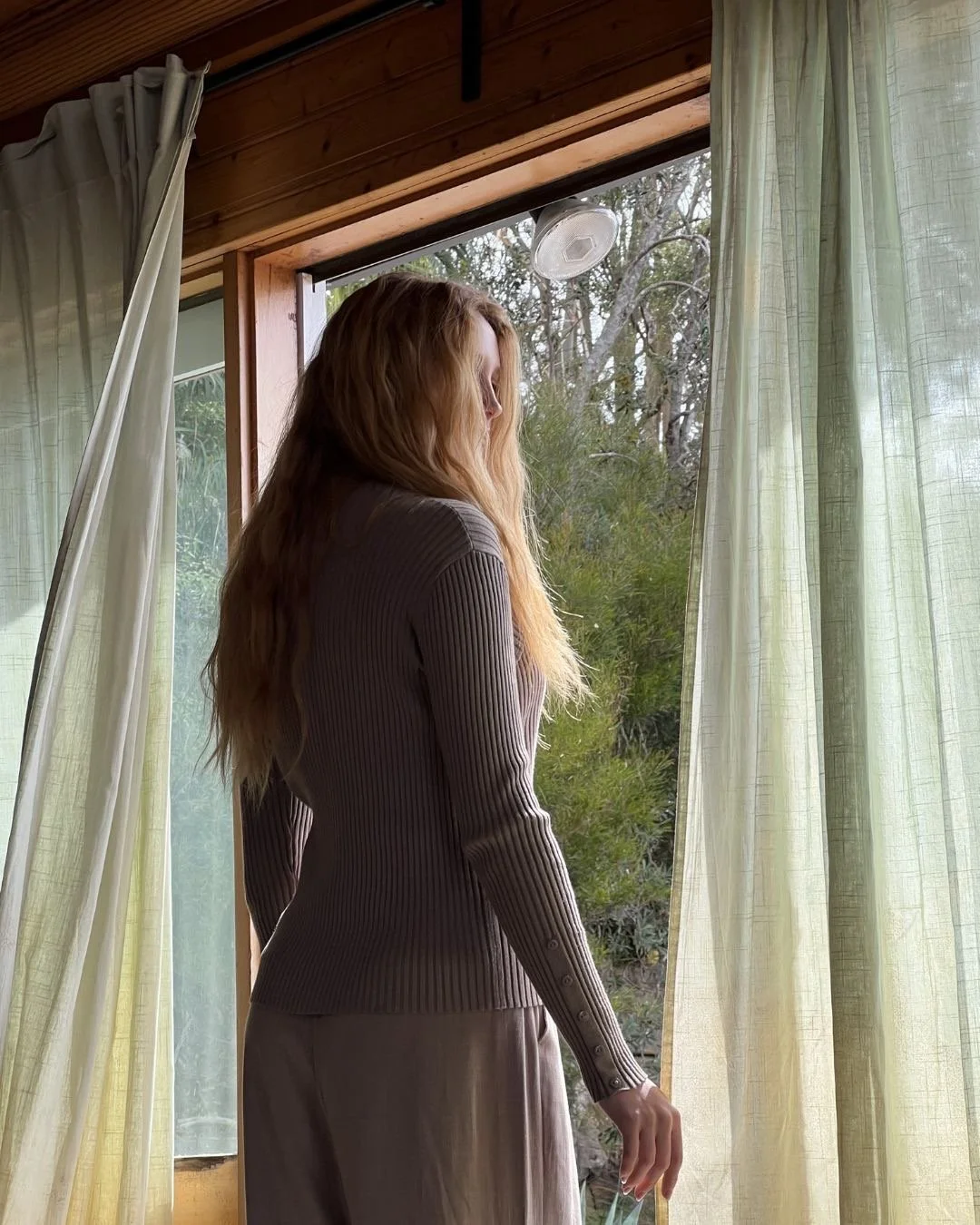
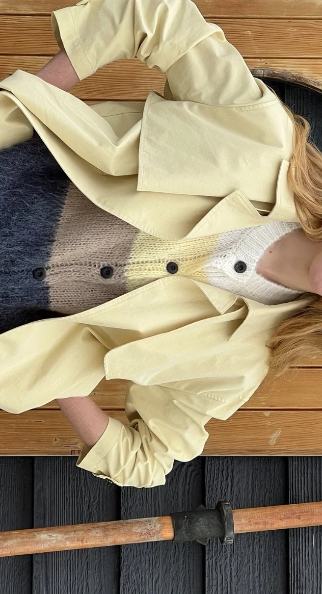
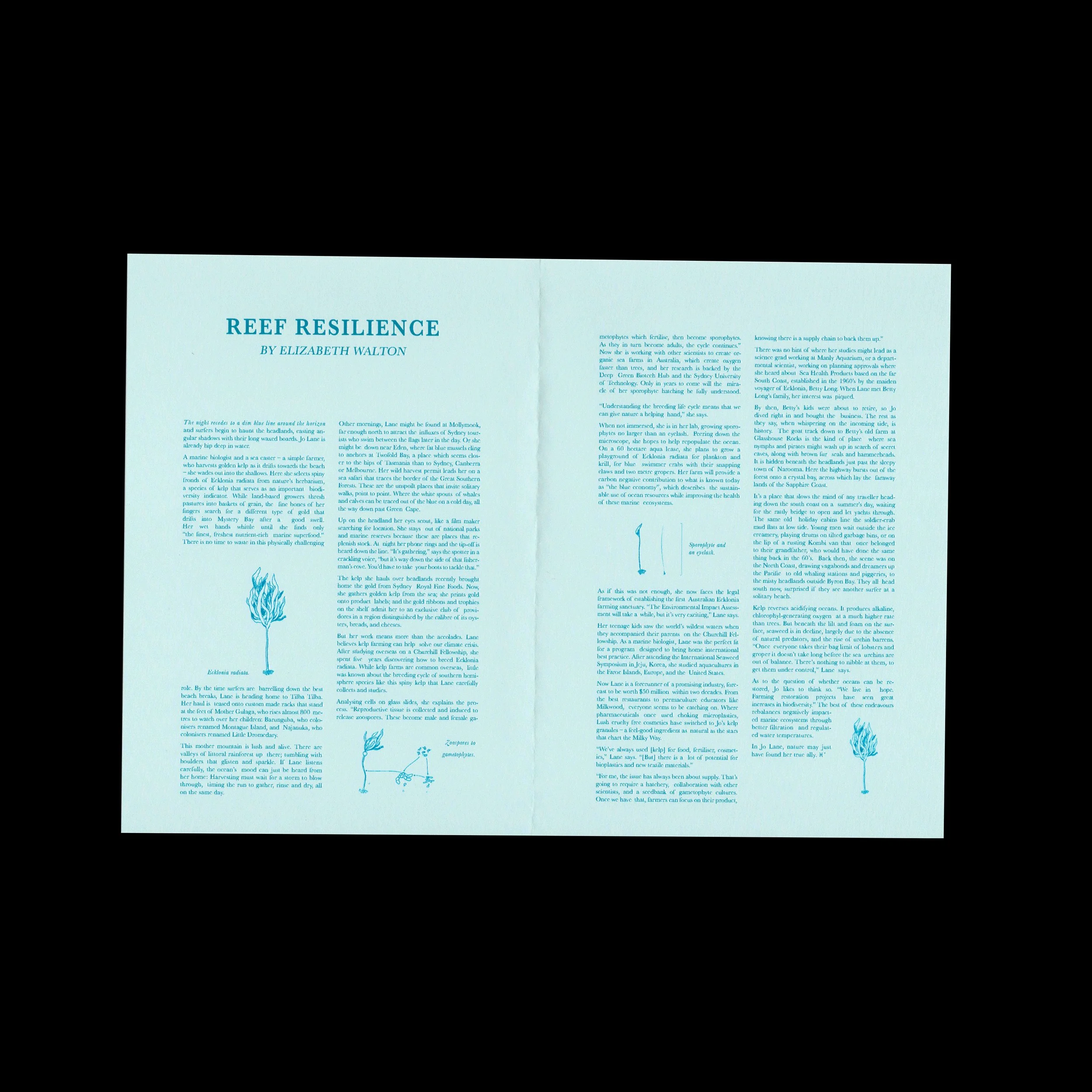
During my time as Digital Marketing Coordinator at TKC, I helped bring multiple collection launches to life, but Isle of Mine AW26 Reverie was one I felt especially close to. Isle of Mine has this calm spirit to it. Grounded, feminine, a little dreamy, always wearable. Through lots of research and testing, I learned the woman we’re speaking to and what she wants to feel when she opens an email or scrolls past a post.

For Reverie, I was involved from the day of the shoot through to launch. I captured BTS moments, helped direct models and support styling on set, then took that raw material and shaped it into the story across every touchpoint. I briefed and built email and web creative, wrote and refined messaging, and planned, designed and scheduled the social rollout so it all felt consistent and intentional.

It sat alongside a busy BAU schedule, but it was work I loved. Moving quickly, staying detail-obsessed, and making sure the final output still felt soft, natural and true to the brand.

TEASER VIDEO:

Footage and editing by me.

SOCIAL ASSETS:

LO-FI/DIGI CAM:

REEF RESILIENCE

Reef Resilience by Elizabeth Walton. Graphic design by Lara Richardson for PETAL Magazine, Volume 1.

“In Jo Lane, nature may just have found her true ally.”

JUNGBRUNNEN

In 1546, Lucas Cranach the Elder painted Der Jungbrunnen, a surreal “Fountain of Youth” scene that captures a very human obsession: the idea that we can refresh, renew, begin again. That reference became the conceptual anchor for JUNGBRUNNEN, a beer branding project where I explored how art history can translate into a contemporary retail identity, with a visual system that’s distinctive, consistent, and built to live across touchpoints.

The hero product is a Watermelon Pilsner: crisp, light and sun-soaked, designed as a summer staple with a slightly unexpected twist.

What I designed

  • Brand identity + visual direction

  • Label system and information hierarchy

  • Carton packaging + dieline execution

  • Campaign touchpoints (posters + billboard/web banner)

Creative direction

The visual system draws on Art Nouveau ornamentation and the atmosphere of the original artwork, refined into a clean, repeatable structure. The result balances ornate detail with clear hierarchy, so the brand feels distinctive on shelf, but still reads fast.

Outcome

A cohesive identity system designed to scale across formats and future flavours — with consistent cues across packaging and campaign assets.

Tools: Adobe Illustrator, InDesign, Photoshop