packaging

Cosmo's Kitchen

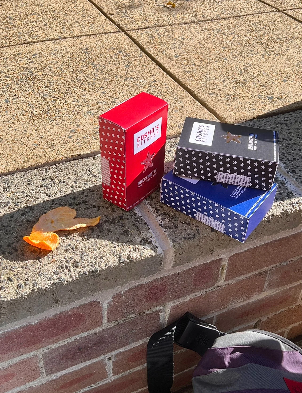
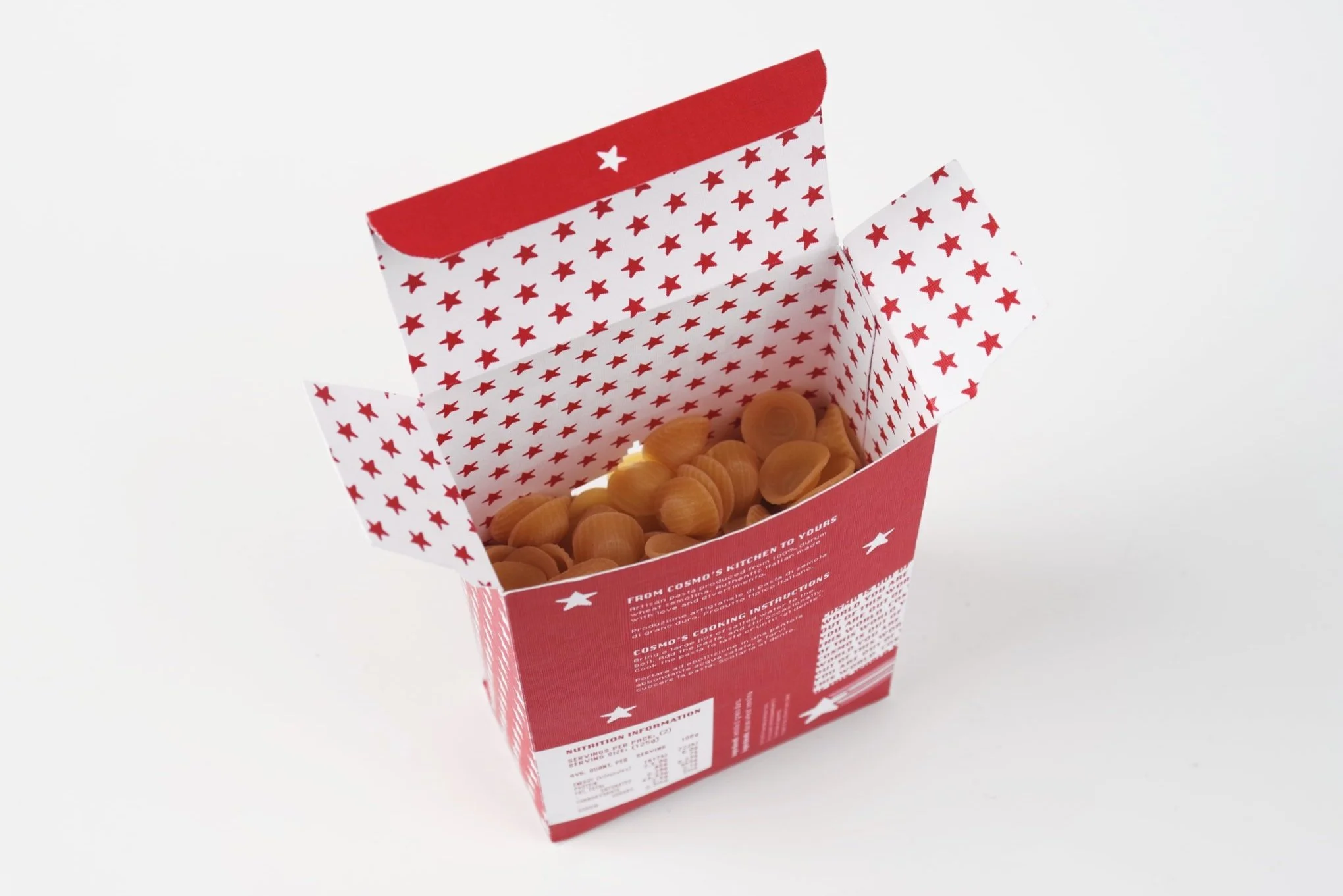
Cosmo’s Kitchen is a pasta packaging concept I designed at TAFE, positioned as an affordable brand with a sharper point of view. The system is typography-led and built for shelf rhythm, balancing bold colour blocks with a strict information hierarchy and a slightly mischievous tone. A custom bitmap star becomes the recurring motif, used as both stamp and pattern to hold the range together and make the packs feel immediate, collectible, and unmistakably Cosmo’s.

JUNGBRUNNEN

In 1546, Lucas Cranach the Elder painted Der Jungbrunnen, a surreal “Fountain of Youth” scene that captures a very human obsession: the idea that we can refresh, renew, begin again. That reference became the conceptual anchor for JUNGBRUNNEN, a beer branding project where I explored how art history can translate into a contemporary retail identity, with a visual system that’s distinctive, consistent, and built to live across touchpoints.

The hero product is a Watermelon Pilsner: crisp, light and sun-soaked, designed as a summer staple with a slightly unexpected twist.

What I designed

  • Brand identity + visual direction

  • Label system and information hierarchy

  • Carton packaging + dieline execution

  • Campaign touchpoints (posters + billboard/web banner)

Creative direction

The visual system draws on Art Nouveau ornamentation and the atmosphere of the original artwork, refined into a clean, repeatable structure. The result balances ornate detail with clear hierarchy, so the brand feels distinctive on shelf, but still reads fast.

Outcome

A cohesive identity system designed to scale across formats and future flavours — with consistent cues across packaging and campaign assets.

Tools: Adobe Illustrator, InDesign, Photoshop