Hot Hunny is a niche branding project developed to display distinctiveness, consistency and innovation. This cheeky concept is made for culinary creatives and design conscious consumers who aren’t afraid to spice things up in the kitchen.


The brief
Develop a brand identity for a niche business in the retail sector, using a full process from Research & Diagnosis → Strategy → Creative, including brand strategy, visual identity, an advertising campaign and presentation. The goal was to build a unique identity that could cut through a saturated market of design-literate, digitally savvy consumers.

The niche
Hot Hunny is a modern take on hot honey: raw honey infused with chilli and native bush spices, produced in Australia with ethical beekeeping at its core. The product is positioned as a premium pantry staple for people who want flavour, craft and design to coexist.
Audience
Hot Hunny is made for cheeky culinary creatives and design-conscious consumers - typically Millennials and Gen Z, mid–high income, who buy artisanal products as a form of self-expression. They’re drawn to visually strong packaging, trend-aware food culture, and brands that feel authentic, transparent and ethically minded.
Competitive landscape (what I positioned against)
To define differentiation, I mapped competitors across both direct and indirect alternatives - from traditional honey brands and supermarket options, to local small-batch chilli honey, imported hot honey, and adjacent “heat” condiments like chilli oils and sauces. The insight: the category is crowded with either traditional cues or generic spicy cues, leaving space for a brand that feels distinctly niche, design-led and personality-forward.
Positioning
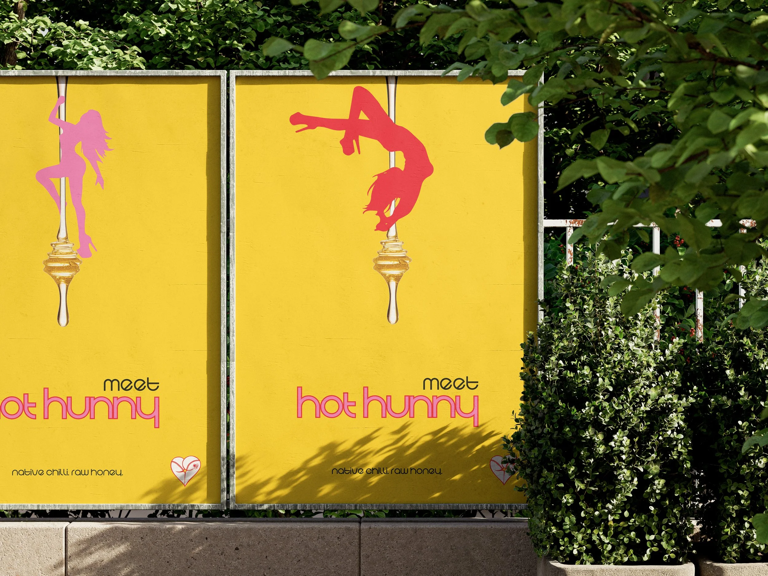
“The only Hot Hunny in your area” became the brand’s core idea - playful, local-feeling and a little provocative, designed to make the product feel like a must-try. The personality pillars are simple and deliberate: Spicy. Cheeky. Unique.
Creative direction (what I designed)
I translated the strategy into a cohesive identity system: logo exploration and refinement, a defined palette, supporting graphics, and style-guide rules to keep the brand consistent across touchpoints. The system was then extended into applications and a campaign concept (“meet hot hunny”) to show how the brand behaves in the real world.
Deliverables
Brand strategy: niche, audience, competitors, positioning, vision
Visual identity: logo development, palette, secondary graphics, style guide
Campaign: concept and applications/mockups
Final presentation deck